Fuuz Form Detail Screen Specification
Article Type: Standard Audience: Solution Architects, Application Designers, Partners Module: Fuuz Platform / Application Design Applies to Versions: 2025.12+ Template Reference:
Form_Screen_-_Standard_System_Page_Design_0_0_1.json
A unified framework for building single-record editing screens across Master Data, Transactional, and Setup applications—ensuring consistent user experience, minimal navigation, and clear separation between reference and editable content.
Note: The original KB article includes an attachment (
FormScreen-StandardSystemPageDesign0011.json, the screen template export). Download it from the source article.
Overview
The Standard Form Design defines a consistent screen architecture for viewing and editing individual records within Fuuz applications. It establishes patterns for layout, component organization, and interaction behaviors that apply universally across MES, WMS, QMS, Asset Management, and custom industrial applications.
Design Principles
- Minimize Navigation: Vertical scrolling within the main content area eliminates the need for users to navigate away from the form to access related information.
- Clear Visual Hierarchy: Distinct separation between immutable reference data (sidebar) and editable content (main area) reduces user confusion.
- Progressive Disclosure: Content is organized in logical cards, allowing users to focus on relevant sections without being overwhelmed.
- Contextual Actions: Actions are available where needed—header for primary save, sidebar for quick actions, inline for record-specific operations.
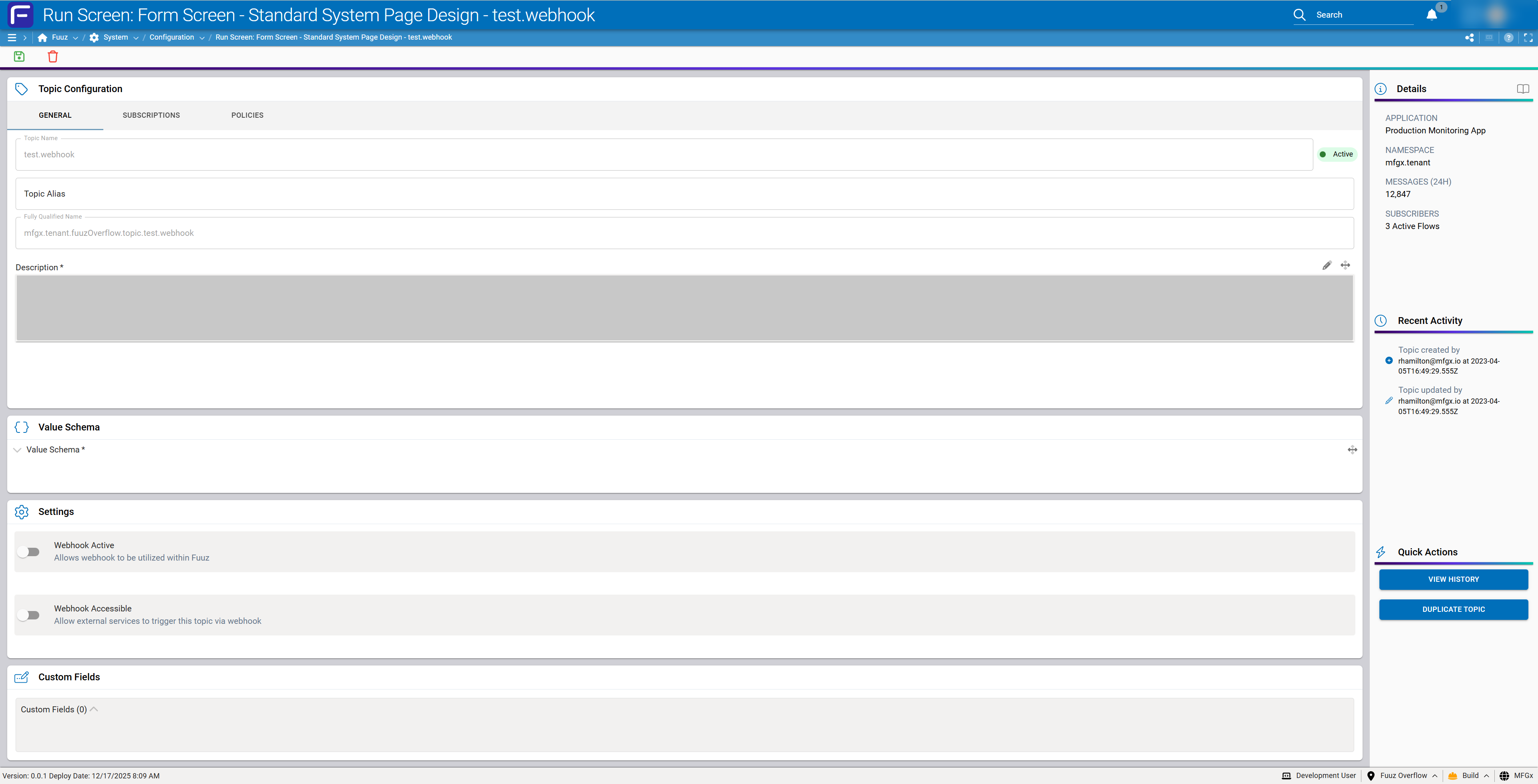
Screen Architecture
Layout Structure
The standard form screen follows a fixed two-column layout with a persistent header:
┌─────────────────────────────────────────────────────────────────┐
│  ScreenHeaderAndActions (40px fixed)              [Save] [Delete]│
├─────────────────────────────────────────────┬───────────────────┤
│                                             │                   │
│  MainContentForm (flexGrow, Y-scroll)       │  SidebarContainer │
│                                             │  (280px fixed)    │
│  ┌─────────────────────────────────┐    │                   │
│  │ PrimaryContent Card                 │    │  ┌─────────────┐  │
│  └─────────────────────────────────┘    │  │ Essential   │  │
│  ┌─────────────────────────────────┐    │  │ Details     │  │
│  │ RelatedRecords Card                 │    │  └─────────────┘  │
│  └─────────────────────────────────┘    │  ┌─────────────┐  │
│  ┌─────────────────────────────────┐    │  │ Activity    │  │
│  │ CodeContent Card                    │    │  └─────────────┘  │
│  └─────────────────────────────────┘    │  ┌─────────────┐  │
│  ┌─────────────────────────────────┐    │  │ Quick       │  │
│  │ SettingsContent Card                │    │  │ Actions     │  │
│  └─────────────────────────────────┘    │  └─────────────┘  │
│  ┌─────────────────────────────────┐    │                   │
│  │ AttachmentsContent Card             │    │                   │
│  └─────────────────────────────────┘    │                   │
│  ┌─────────────────────────────────┐    │                   │
│  │ CustomFieldContent Card             │    │                   │
│  └─────────────────────────────────┘    │                   │
│                                             │                   │
└─────────────────────────────────────────────┴───────────────────┘
Component Hierarchy
ROOT (Screen)
├── ScreenHeaderAndActions
│   └── SaveAction, DeleteAction, etc.
└── MainContainer
    ├── MainContentForm (scrollable)
    │   ├── PrimaryContent
    │   ├── RelatedRecords (optional)
    │   ├── CodeContent (optional)
    │   ├── SettingsContent (optional)
    │   ├── AttachmentsContent (optional)
    │   ├── NotesContent (optional)
    │   └── CustomFieldContent (optional)
    └── SidebarContainer (fixed 280px)
        ├── EssentialDetails
        ├── DataChangeActivity
        ├── QuickActionsContainer
        └── [Deployment-specific sections]
Header Specifications
ScreenHeaderAndActions
| Property | Value |
|---|---|
| Height | 40px (fixed) |
| Layout | Flex row, space-between, center aligned |
| Border | Bottom: 1px solid #e2e8f0 |
| Shadow | true (subtle drop shadow) |
Save Action Behavior
Note: Enablement Rules:
- Disabled when the form is not dirty (no changes made)
- Disabled when any required field is null or invalid
- Enabled only when form is dirty AND all validations pass
Main Content Area
MainContentForm Container
| Property | Value |
|---|---|
| Width | flexGrow: true (fills remaining space) |
| Height | 100% of MainContainer |
| Overflow-Y | auto (vertical scroll when needed) |
| Overflow-X | hidden (no horizontal scroll) |
| Padding | 12px |
| Scrollbar | thin, branded colors (#5b30df / #e2e8f0) |
| Card Layout | Grid, 1 column, 12px gap |
Card Display Order
Default ordering prioritizes the most commonly accessed information:
- Primary Content (always first)
- Related Records (if applicable)
- Code Content (if applicable)
- Settings Content (if applicable)
- Attachments Content (if applicable)
- Notes Content (if applicable)
- Custom Fields Content (always last when present)
Tip: Designer Note — Designers may rearrange cards based on deployment-specific user preferences. The system should persist card ordering preferences per user or role.
Card Specifications
Standard Card Structure
All cards follow a consistent structural pattern:
| Element | Specification |
|---|---|
| Container | width: 100%, shadow: true, borderRadius: 6px, background: paper |
| Header Row | height: 40px, padding: 12px, borderBottom: 1px solid #e2e8f0 |
| Header Icon | 24x24px, color: primary, variant: light |
| Header Label | font-size: 16px, font-weight: bold, font-family: Roboto |
| Content Area | padding: varies by card type, flexGrow: true |
Card Reference Table
| Card | Element Name | Icon | Visibility |
|---|---|---|---|
| Primary Content | PrimaryContent |
tag | Always visible |
| Related Records | RelatedRecords |
link | When model has relationships |
| Code Content | CodeContent |
brackets-curly | When model has code/JSON fields |
| Settings | SettingContent |
gear | When model has boolean settings |
| Attachments | AttachmentsContent |
paperclip | When model supports attachments |
| Notes | NotesContent |
message-lines | When model supports notes |
| Custom Fields | CustomFieldContent |
pen-field | When custom fields are defined |
Primary Content Card
Purpose: Contains all general editable fields for the current record. This is the primary workspace for user input.
- Minimum height: 500px
- Supports internal tabs for complex entities with multiple relationship types
- Place most frequently edited fields at the top
- Group related fields logically (identification, classification, configuration)
Related Records Card
Purpose: Displays and manages child/related entities.
- Simple (1-2 child types): Expandable sections within the card
- Complex (3+ child types): Tabs within Primary Content, one per child type
- Summary table with key columns, row count, and inline actions (View, Add)
Code Content Card
Purpose: Contains JSON schemas, JSONata expressions, SQL queries, or other structured code fields.
- Uses
JSONInputcomponent - Collapsible: true, collapsedByDefault: true
- Supports syntax highlighting
Settings Content Card
Purpose: Contains boolean configuration values as switches or checkboxes.
- Layout: Grid, 1 column, 12px gap
- Each setting row: padding 6px, background: light, borderRadius: 4px
- Switch/checkbox on left (60px), label and description on right
Attachments Content Card
Purpose: Manages file attachments, documents, images, and media.
Common attachment types:
- SOPs, work instructions, procedures
- Quality certificates, inspection reports
- CAD drawings, schematics
- Photos (defects, setup verification)
- Compliance documents, certifications
Custom Fields Content Card
Purpose: Displays user-defined custom fields that extend the base data model.
- Component:
CustomFieldsInputwith dataPath:_customFields - Always positioned as the last card in MainContentForm
- Supports field grouping via
expandGroupsproperty
Sidebar Specifications
SidebarContainer
| Property | Value |
|---|---|
| Width | 280px (fixed) |
| Height | 100% of MainContainer |
| Layout | Grid, 1 column, 12px gap |
| Padding | 8px |
| Background | default (light gray) |
| Overflow | hidden |
Essential Details Section
Purpose: Displays immutable reference information that identifies the record.
Standard Components:
- Primary Image: Product photo, equipment image, location map, or record avatar
- Record Identifiers: Type, ID, Code, Label (read-only DisplayText fields)
- Parent Hierarchy: Linked chain showing record lineage (clickable)
- Status Indicator: Visual badge showing current status
Parent Hierarchy Display Pattern:
HIERARCHY
Sales Order: SO-2024-0847 →
  └─ Production Order: PO-2024-1923 →
      └─ Work Order: WO-2024-4521 (current)
Data Change Activity Section
Purpose: Displays audit trail information showing who created and last modified the record.
- Required fields:
createdAt,createdByUser.email,updatedAt,updatedByUser.email - Display format: Icon + "[Entity] [action] by [email] at [timestamp]"
Quick Actions Section
Purpose: Provides contextual actions relevant to the current record.
Standard Actions:
- View History
- Clone Record
- Export
- Delete (with confirmation)
Deployment-Specific Actions (examples):
- Start Production
- Release to Floor
- Request Inspection
- Generate Label
- Submit for Approval
Deployment-Specific Sections
The sidebar supports additional custom sections as required by specific deployments:
- Inventory Summary (for WMS records)
- Quality Metrics (for MES records)
- Maintenance Schedule (for Asset records)
- Cost Summary (for Work Order records)
Related Records Strategy
Relationship Direction Patterns
Upward (Parent Chain)
Display in Essential Details sidebar as read-only reference links. For relationships 3-4 levels deep, show the full lineage with clickable links at each level.
Downward (Child Records) - Level 1
| Scenario | Pattern |
|---|---|
| 1-2 child types, simple | Related Records card with expandable sections |
| 3+ child types, complex | Tabs within Primary Content, one per child type |
Deep Drilling (Levels 2-4)
Use a slide-out drawer pattern:
- Click child record row to open right-side drawer (400-600px width)
- Drawer shows child form in condensed view
- Drawer can stack (clicking grandchild opens another layer)
- Breadcrumb at top shows depth:
Work Order > Operation 10 > Material Issue - Maximum 3 drawer layers before forcing full navigation
- "Open in New Tab" action available at any level
Relationship Explorer (Complex Entities)
For highly relational entities (BOMs, Routings, Process Flows), use a dedicated Relationship Explorer:
┌─────────────────────────────────────────────┐
│ 🔗 Relationships                        [↗] │
├─────────────────────────────────────────────┤
│  [Tree View] [List View]                    │
│                                             │
│  ▼ Operations (4)                           │
│     ├─ OP10: Cut ─┬─ Materials (3)          │
│     │             └─ Tools (1)              │
│     ├─ OP20: Weld                           │
│     └─ ...                                  │
│  ▶ Quality Checks (2)                       │
│  ▶ Documents (5)                            │
└─────────────────────────────────────────────┘
Data Model Considerations
Form Profiles by Data Model Type
Master Data (Equipment, Materials, Locations, Products)
- Primary Content: Classification, specifications, attributes
- Related Records: BOM components, alternate locations, substitutes
- Attachments: Drawings, specifications, certificates
- Custom Fields: Deployment-specific attributes
- Essential Details: Primary image prominently displayed
Transactional Data (Work Orders, Inventory Movements, Quality Records)
- Primary Content: Header info, quantities, dates, assignments
- Related Records: Operations, material issues, labor entries
- Notes: Shift notes, issue documentation
- Attachments: Photos, inspection results
- Essential Details: Full parent hierarchy chain
Setup/Configuration Data (Topics, Flows, Rules, Integrations)
- Primary Content: Configuration parameters
- Code Content: Schemas, expressions, queries
- Settings: Feature toggles, behavioral flags
- Essential Details: Application/namespace context
Card Visibility Rules
| Card | Visibility Condition |
|---|---|
| Primary Content | Always visible |
| Related Records | When model has defined child relationships |
| Code Content | When model contains JSON/code field types |
| Settings Content | When model has boolean settings fields |
| Attachments Content | When model supports file attachments |
| Notes Content | When model supports notes/comments |
| Custom Fields Content | When custom fields are defined for the model |
Design Tokens
Colors
| Token | Value | Usage |
|---|---|---|
| primary | #5b30df |
Icons, active states, links |
| text-primary | #1e293b |
Primary text, labels |
| text-secondary | #64748b |
Descriptions, help text |
| border | #e2e8f0 |
Dividers, card borders |
| success | #2e7d32 |
Active status, save enabled |
| brand-gradient | 90deg, #39005a → #5b30df → #03caaf |
Section separators |
Spacing
| Token | Value | Usage |
|---|---|---|
| card-gap | 12px | Gap between cards |
| card-padding | 12px | Internal card padding |
| field-padding | 6px | Form field padding |
| header-height | 40px | Screen header, card headers |
| sidebar-width | 280px | Fixed sidebar width |
| border-radius | 6px (cards), 4px (inputs) | Rounded corners |
Typography
| Element | Style |
|---|---|
| Card Header | Roboto, 16px, Bold |
| Field Label | body1, uppercase, color: #64748b |
| Field Value | body1 |
| Help Text | body2, color: #64748b |
| Status Badge | 12px, centered |
Naming Conventions
Element Names
| Element Type | Naming Pattern |
|---|---|
| Layout Containers | PascalCase describing purpose (e.g., MainContentForm, SidebarContainer) |
| Card Containers | [CardType]Content (e.g., PrimaryContent, CodeContent) |
| Card Headers | [CardType]HeaderContainer (e.g., PrimaryContentHeaderContainer) |
| Icons | [Context]Icon (e.g., PrimaryContentIcon, QuickActionsIcon) |
| Labels | [Context]Label (e.g., PrimaryContentLabel, SettingLabel) |
| Forms | Form[N] or descriptive name (e.g., Form1, PrimaryForm) |
| Separators | BrandSeparatorContainer[N] |
Form Element Binding
Each card containing editable fields should have its own Form element:
api:"Application"model:[DataModel name]dataPath:"edges[0]"autoLoad:true (for display), false (for save-only)blockNavigationWhenDirty:true
Verification
To confirm correct implementation of the Standard Form Design:
- Layout: Sidebar remains fixed at 280px; main content scrolls vertically only
- Save Button: Disabled when form is clean; enabled only when dirty + valid
- Card Visibility: Cards appear/hide based on data model capabilities
- Essential Details: Primary image displays; parent hierarchy links are clickable
- Related Records: Drill-down opens drawer; maximum 3 layers stack correctly
- Element Names: All custom.elementName values follow naming conventions
Troubleshooting
- Horizontal scroll appears on MainContentForm → Resolution: Check that
overflow-x: hiddenis set on the MainContentForm container - Save button always disabled → Resolution: Verify form is bound correctly with
blockNavigationWhenDirty: trueand form dirty state is being tracked - Cards not appearing → Resolution: Check visibility conditions match data model capabilities; ensure card container is not set to
hidden: true - Sidebar overflows → Resolution: Verify SidebarContainer has
overflow: hiddenand fixed width of 280px - Related records drawer exceeds 3 layers → Resolution: Implement layer count check; force full navigation after layer 3
- Brand separator not showing gradient → Resolution: Check
background-image: linear-gradient(90deg, #39005a, #5b30df, #03caaf)is applied
See Also
Related Articles
HMI Template Standard - ISA-101 Compliant
Article Type: Concept / Standard Audience: Solution Architects, Application Designers, HMI Engineers, Partners Module: Fuuz Platform / Screen Designer Applies to Versions: 2025.7+ Reference Standard: ANSI/ISA-101.01-2015 1. Overview This standard ...Mobile Screen Design Standard
Article Type: Standard / Reference Audience: Solution Architects, Application Designers, Developers Module: Fuuz Platform - Mobile Application Design Applies to Versions: 2025.12+ Template Reference: mobile_screen_standard_template_0_0_1.json 1. ...Master Data Table Screen Design Standard
Master Data Table Screen Design Standard Article Type: Standard / Reference Audience: Solution Architects, Application Designers, Developers Module: Fuuz Platform - Application Designer Applies to Versions: 2025.12+ Template Reference: ...Setup Data Table Screen Design Standard
Article Type: Standard / Reference Audience: Solution Architects, Application Designers, Developers Module: Fuuz Platform - Application Designer Applies to Versions: 2025.12+ Template Reference: Table_Screen_Design_Template_-_Setup_0_0_1.json 1. ...Historical Data Table Screen Design Standard
Article Type: Standard / Reference Audience: Solution Architects, Application Designers, Developers Module: Fuuz Platform - Application Designer Applies to Versions: 2025.12+ Template Reference: Table_Screen_Design_Template_-_History_0_0_1.json 1. ...