2024.3 (March 2024)
Article Type: Release Notes Audience: All Users Module: Platform Releases
The Fuuz platform team is welcoming the return of spring with a release full of exciting features and improvements. This month, we're highlighting the screen designer, where the team has rolled out several new elements and lots of new configuration properties on existing elements. Read on to learn more!
Screen Designer Panel Restructuring
The 2024.3.0 release features a significant update to the way one of our flagship designers is laid out. With this release, the Screen Designer has been reorganized to group all "panel" elements into a consistent tabbed layout on the right-hand side of the screen. This means the Toolbox panel, previously located on the left side of the screen, is now found in the Elements tab in the right-hand panel. Panels with sections, such as the Properties panel, also now have a way to quickly jump to a specific section.
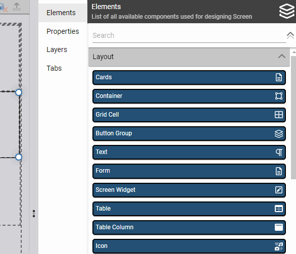
These changes make it easier for users to find the features they're looking for, streamline the design work to add more Screen Designer features, and free up space on the left side of the screen for UI elements related to the Application Designer when designing screens there.
There are more refinements to this new navigation system already under way to make sure it looks and behaves exactly how users expect. Once we're happy with the result, we'll be carrying this concept over to the Schema Designer, Flow Designer, and other places in the system with similar panel layouts to ensure a consistent navigation experience throughout the platform. As always, if you have feedback you'd like to share on the UI changes, please reach out through our Community - we'd love to hear your thoughts!
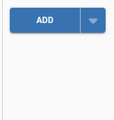
New Button Elements
The March release includes two new button elements, supporting more complex arrangements of flow and action buttons in screens.
The first of these is a new "Button Group" Layout element. The Button Group acts like a container, but only allows flow or action buttons to be placed inside it. These buttons will be visually grouped together on the screen, allowing related actions to be tied together to clarify the interface for users.
The second new button element is a "Split Button" Action element. This element allows multiple actions to be configured in a single button; the first action will always be available to click, while the other actions will be available in a pop-open menu accessible via the "down" arrow on the button. This element is a great way to implement actions that are related to others but less frequently used, keeping them in the same place while also saving space on the screen.

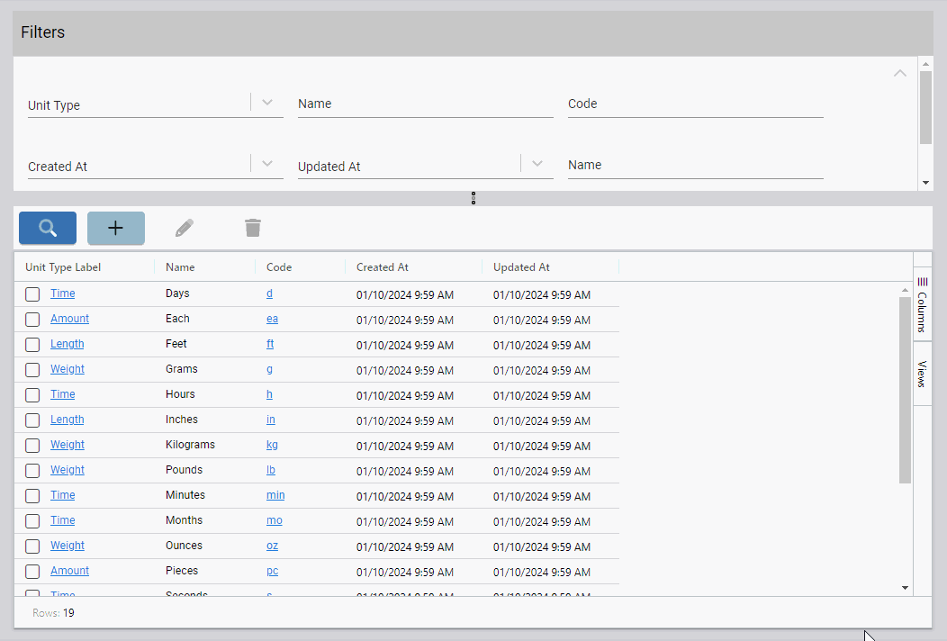
Resizable Panel Element
This month's release includes another new space-saving Layout element: a Resizable Panel. This element behaves very similarly to the panels in our own designers - in fact, it's the same underlying code! Resizable Panels allow screen designer users to drop in a container that can be resized by the end user to fit their needs, allowing those end users to decide how much or how little space to devote to the content. This is great for things like filters, visualizations, and detailed data that may not always be required, but can often consume a lot of space when it is needed.
New Element Configuration Properties
The March 2024 release also includes a number of new element configuration properties, making existing elements more versatile.
Text Display Element
First up, the Text Display element has five new properties to configure layout, font size, and font color for the label and data.
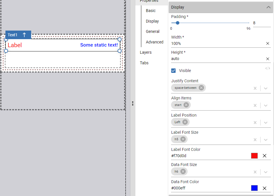
Table Element
Next up, Table elements have several new properties to further disable interactivity for tables, which is useful in some screens to prevent users from accidentally changing the screen in a way they don't expect. Two new properties disable the ability to drag the header cells to perform actions - one for reordering and one for hiding from the view - while a third property hides the table header entirely to reclaim that screen space in use cases where it may not be necessary.
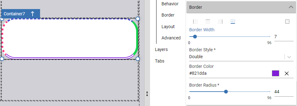
Container Element
Finally, Container elements now have a very flexible configuration for border properties, allowing border style, thickness, and color to be specified for the entire container or for one edge at a time.
More Highlights
Login Error Debugging Information
In addition to the new and improved screen elements, the 2024.3.0 release also includes an improvement to the login screen and process specifically aimed at helping administrators when their users encounter issues while logging in. When a user fails to successfully log in, that user can now hover over a question mark next to the error message to view more information. In addition to some error-specific information, this will always include an authentication event ID the administrator can use to locate the corresponding authentication event in Fuuz to see more internal information about the login request and why it may have failed.
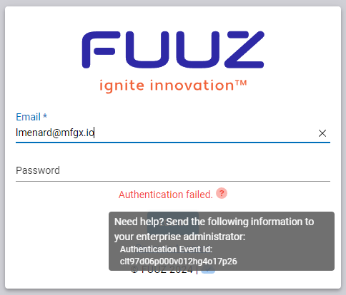
Together with the Authentication Events screen in Fuuz, this additional error information can help guide administrators toward the correct resolution for their user's problem - perhaps they need their password reset, are entering the wrong email address, or entered a multi-factor authentication token incorrectly.
Full Release Notes: 2024.3.0
Data Team
Security
- Fixed several edge case bugs causing incorrect error messages to return during authentication
- Added help icon tooltip to communicate additional login error information, such as authentication event ID, to help administrators debug potential issues
- Added Application Development tenant type to build environments
- Temporarily reverted change preventing access control policy modifications on custom tenants
- Updated error message for administrative actions to clarify that users need to switch to the administration tenant
Schema Designer
- Added integration tests for default sequence values, required fields, unique fields, and unique required fields
Data Change Capture
- Updated service state rehydration to more efficiently filter models to reduce startup memory consumption
Integration Team
Edge Gateway
- Added additional error handling around status update calls to catch edge case crashes
Orchestration Team
Data Flow Designer
- Added "Module Not In List" filter to Data Flows table
Log Capture
- Updated to verify message size to prevent attempts to write excessively large log messages to the database
Scripting Language
- Updated Input Schema and Output Schema sections in Saved Transform Editor to use new Schema Builder input
User Interface Team
Framework
- Updated to latest favicons library version
- Updated scroll behavior to ensure consistent padding around screen contents
- Corrected a bug causing data transforms on form inputs to behave inconsistently after initial form data load
- Updated role menu behavior to correctly utilize menu icon and title properties in the sidebar
Screen Designer
- Restructured layout to group all designer panels under tabs on the right hand side of the screen
- Added a Button Group screen element which visually groups buttons together
- Added a Split Button screen element, supporting a hybrid button/action menu
- Added Resizable Panel screen element which creates a user-resizable panel in screens
- Added
Disable Dragging To Reorder Columnsproperty to tables to prevent dragging to reorder columns - Added
Disable Dragging To Hide Columnsproperty to tables to prevent dragging to hide columns - Added
Hide Table Headerproperty to tables to hide column headers - Added border configuration properties to container elements
- Added
Justify Content,Label Font Size,Label Font Color,Data Font Size, andData Font Colorproperties to display text element - Added
Disable Hover EffectandDisable Ripple Effectproperties to Action Button element - Updated auto-save feature to not save when screen is deployed, and to display a green checkmark on the save icon instead of snackbar on successful save
- Corrected a bug that could cause inconsistent tab width for vertical tab bar elements
Application Designer
- Added a skeleton loading UI while navigation panel is loading
Components
- Fixed a bug causing the cron visual builder to not output a cron string
- Added "required" validation error message and visual display to icon picker input
See Also
Related Articles
2026.3 (March 2026)
Article Type: Release Notes Audience: All Users Module: Platform Releases Note: QA Release Date: March 3, 2026. Production Release Date: March 17, 2026. 2026.3 Release Highlights As promised last month, we have a packed list of new features and ...2023.3 (March 2023)
Article Type: Release Notes Audience: All Users Module: Platform Releases Here are some of the major highlights from the March 2023 release of the Fuuz platform. Screen Widgets & Dialogs One of the most exciting features (or sets of features, really) ...2022 Q1 Fuuz Package Updates (03/11/2022)
Article Type: Release Notes Audience: All Users Module: Platform Releases Release notes for Fuuz standard package updates published the week of March 11, 2022. Fuuz Packages IOT 1.5.0 See Fuuz Standard Packages - IOT. Initial version with 9 tables ...2026.4 (April 2026)
Article Type: Release Notes Audience: All Users Module: Platform Releases Note: QA Release Date: April 7, 2026. Production Release Date: April 21, 2026. Full Release Notes: 2026.4.0 DevOps Updated TypeScript engine to latest 5.x version Data GraphQL ...2026.2 (February 2026)
Article Type: Release Notes Audience: All Users Module: Platform Releases Note: QA Release Date: February 3, 2026. Production Release Date: February 24, 2026 (one week later than the regular production release date). 2026.2 Release Highlights In ...