2024.12 (December 2024)
Article Type: Release Notes Audience: All Users Module: Platform Releases
This month, we're focusing on one large new feature for the screen designer: a new Chart element!
New Chart Screen Element
This new screen element, found under the Display group, is aimed at streamlining the creation of visualizations, charts, and widgets on Fuuz screens. The element is completely self-contained - no need to worry about forms - and all configuration is done through a streamlined wizard!
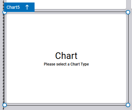
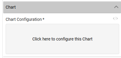
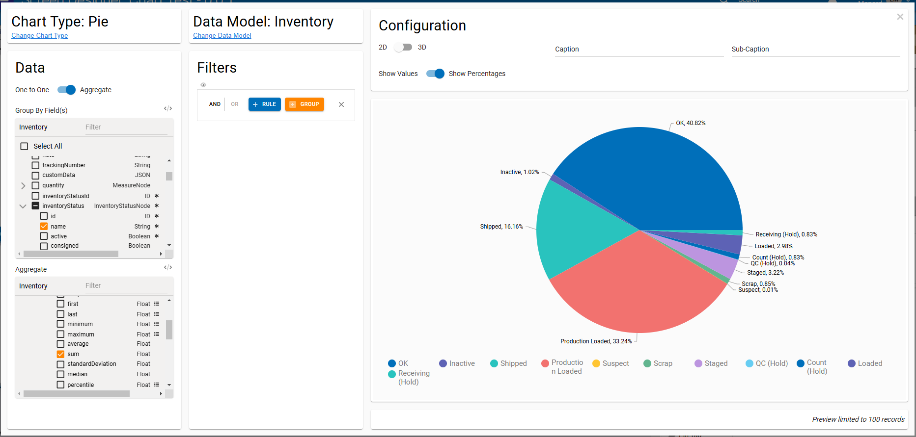
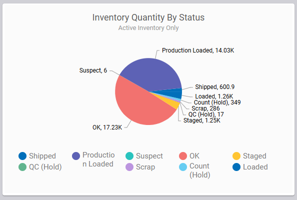
Let's walk through an example of building a visualization to see how this new element works. Let's say we want to see a breakdown of active inventory by status: whether it's OK, loaded, suspect, or another status. We start by dragging a Chart element from the toolbox into our screen. It'll render initially with a message saying we need to select a chart type. Inside the Properties panel for the element, we'll find a Chart Configuration field we can click to open the configuration wizard.
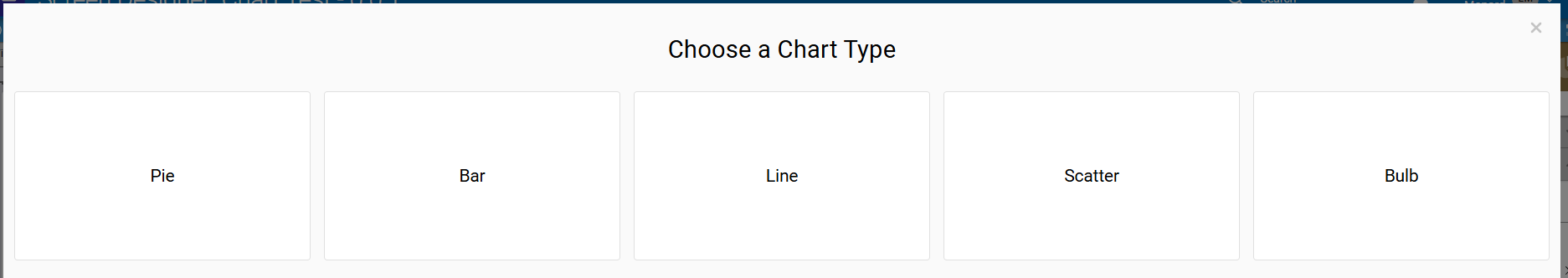
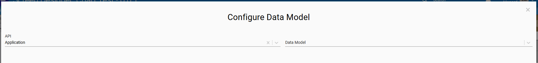
The first two screens in the wizard will ask us to select a chart type and a data model. (Don't worry, you can change these later if you need to!) We want a Pie chart, and we want to pull our data from the Inventory data model, so we'll select those options.
When we select a data model, the wizard switches to a panel layout. From here, we'll work left-to-right to configure the chart.
We'll start with the Data panel. We first need to decide if we're using One to One or Aggregated data for this chart. One to One data will render one data point for each record in the data model; that's often helpful for plotting transactional data over time, but in this case, we want to aggregate (sum) the inventory quantities by status, so we'll flip the switch from One to One to Aggregate.

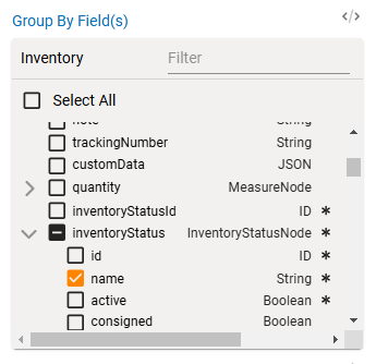
Next, we select which fields we want to Group By. Since we want to view inventory quantities by status, we'll find the inventoryStatus relation field, expand it, and select the name field inside it to group by the inventory status name.
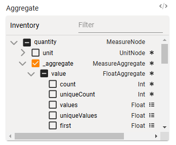
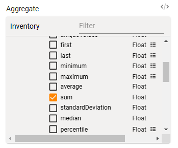
Finally, we need to select which fields we're aggregating and how we're aggregating them. Since we want a total of inventory quantity, we'll find the quantity measure field and expand it, then expand the _aggregate field to list the fields we can apply aggregations to. We want to compute a sum of the inventory quantity value, so we'll expand value, find the sum operator, and select it.
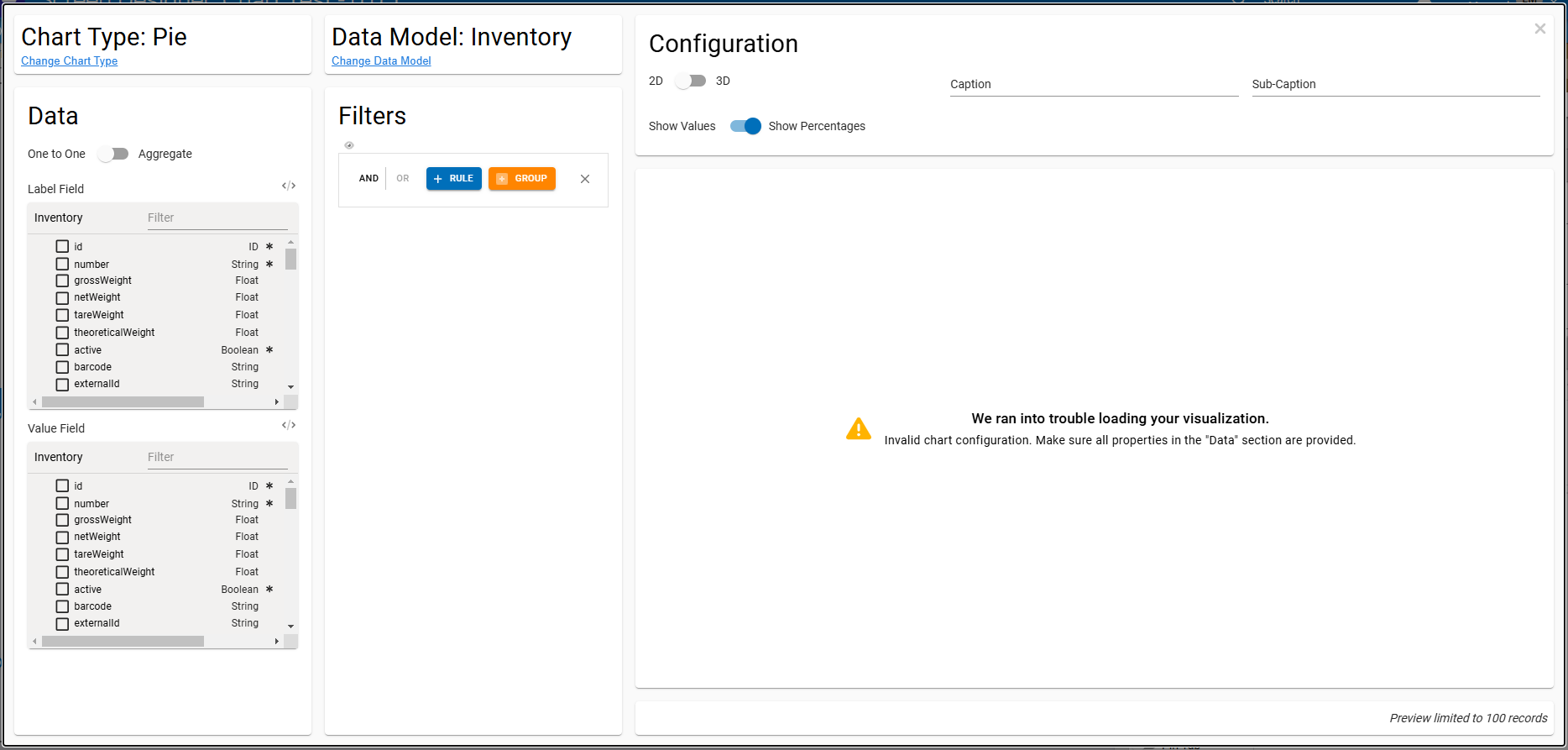
When we do that - assuming we have inventory records in the system - we'll immediately see a preview of the pie chart we want. If we were happy with this, we could close the configuration dialog and we'd be done - but we have a few more tweaks we want to make.
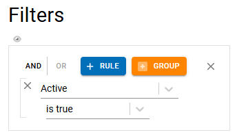
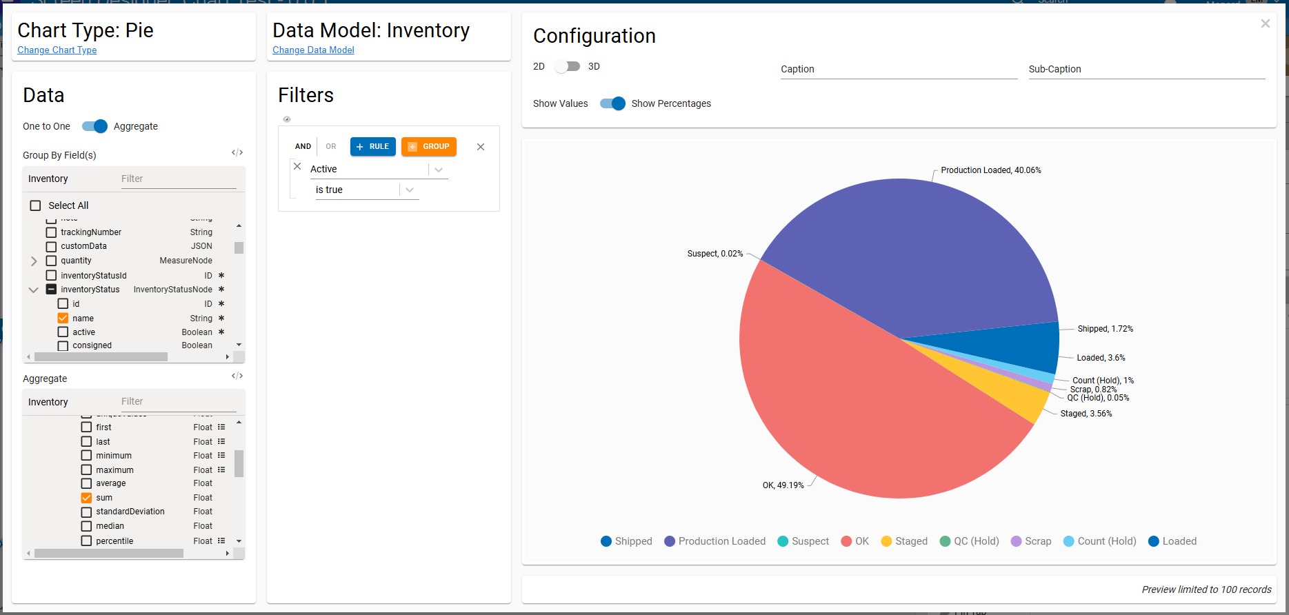
First of all, we specified we wanted to see a breakdown of active inventory by status. That means we need to use the Filters panel to apply a filter to the data set. Thankfully, this is simple: just click the + button, then select the Active field in the first Field dropdown and "is true" in the second Operator dropdown - and that's it!
When the filter is applied, you'll see the preview update to drop out any inactive inventory. There are now a lot fewer statuses in our pie chart, removing some of the noise.
Finally, we can fill out some cosmetic configuration options to add a caption or sub-caption, change whether we display percentage or numerical values, and more.
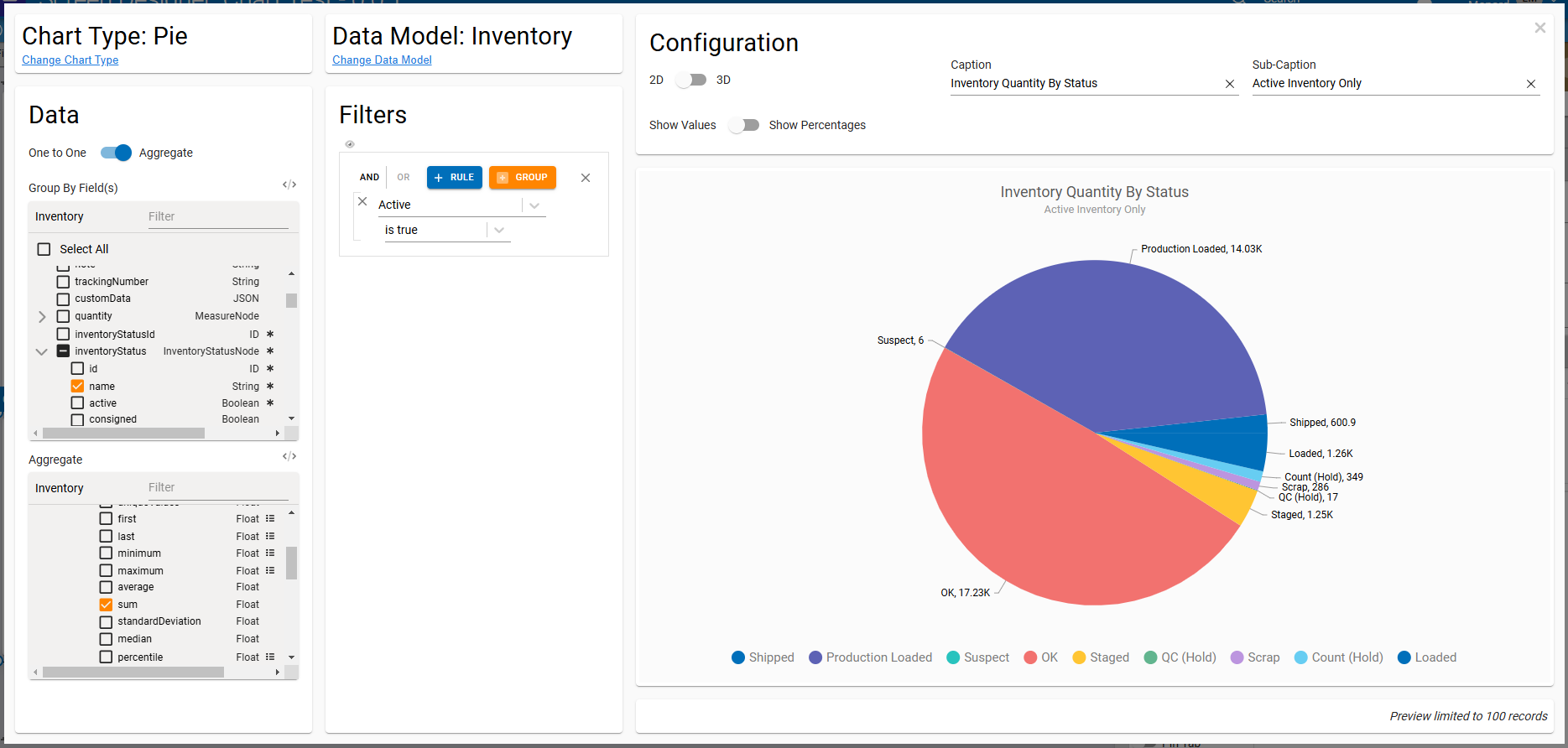
Once we're satisfied with our visualization, we can close the dialog and save our screen. When we run the screen, we'll see our chart!
While this new element already simplifies creating widgets and simple charts, we have lots of improvements planned to make it even more useful - like expanding the cosmetic configuration options available in the wizard and displaying a more accurate preview of the chart in the screen designer canvas. Keep an eye out for those features as they roll out in Q1!
Full Release Notes: 2024.12.0
Data Team
Security
- Updated message when changing a user's access type at the enterprise level to clarify the effect the change will have
- Updated application user replication to apply system user audit information to replicated records to address screen errors that could occur when a user was granted access to a tenant by an enterprise administrator without access to that tenant
DevOps Team
- Updated RabbitMQ message broker to 3.13.7
- Increased default RabbitMQ volume size and updated RabbitMQ
disk_free_limitto match
Integration Team
Edge Gateway
- Added better error handling when decoding stored API keys
Orchestration Team
Service Maps
- Updated RabbitMQ service map to better handle specific types of channel errors
- Updated Redis service map to more gracefully handle Redis being offline or unresponsive
Data Flows
- Updated Query and Mutate nodes to remove an intermediate network request to increase efficiency and reliability
User Interface Team
Framework
- Corrected a UI error that could occur when using
$moment()in web flows
Components
- Updated alert and confirm dialogs to retain line breaks in displayed message text
- Updated alert, confirm, and form dialogs to add dividers between dialog header, body, and actions
Screen Designer
- Added a Chart screen element for building streamlined charts and visualizations
See Also
Related Articles
2023.12 (December 2023)
Article Type: Release Notes Audience: All Users Module: Platform Releases Note: QA Release Date: December 5, 2023. Production Release Date: December 12, 2023. Note: The December production release is scheduled for a week earlier than normal - the ...2025.12 (December 2025)
Article Type: Release Notes Audience: All Users Module: Platform Releases Note: QA Release Date: December 4, 2025. Production Release Date: December 16, 2025. We've got some great holiday gifts for you with this month's release - read on to learn ...2025.1 (January 2025)
Article Type: Release Notes Audience: All Users Module: Platform Releases Note: QA Release Date: January 7, 2025. Production Release Date: January 21, 2025. Full Release Notes: 2025.1.0 Data Team GraphQL API Standardized default model mutation ...2024.11 (November 2024)
Article Type: Release Notes Audience: All Users Module: Platform Releases Due to a busy month, the 2024.11 release notes don't have highlights. If you have questions about any of the items listed in the full release notes below, feel free to reach ...2026.1 (January 2026)
Article Type: Release Notes Audience: All Users Module: Platform Releases Note: QA Release Date: January 6, 2026. Production Release Date: January 20, 2026. With the holidays ending and the team hard at work on prep for ProveIT next month, the ...